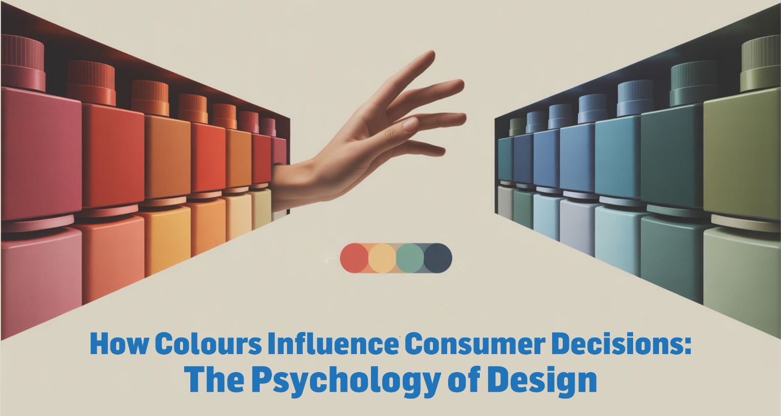
How Colours Influence Consumer Decisions: The Psychology of Design
In today’s hyper-visual world, where milliseconds matter, colours have become silent storytellers. They don’t just make things look good—they shape how we feel, think, and act. For any creative agency in India, especially one navigating the wave of creative agency trends 2025, understanding the psychology of design is essential for crafting campaigns that click.
Why Colour Psychology Matters
Colours are more than just decoration—they’re emotional cues. Research shows that consumers form an opinion about a product within the first 90 seconds of interaction, and up to 90% of that judgement is based on colour. Imagine the impact that one design choice can have in a scroll-heavy, ad-saturated market like ours.
Red signals urgency and excitement. Yellow is cheerful, youthful. Blue builds trust. Green evokes wellness and nature. These aren’t random associations—they’re wired into our brains through cultural influence and behavioural psychology.
As highlighted in Gregory Ciotti’s research on color psychology in marketing, colours significantly impact consumer decisions. Ciotti explains that red creates a sense of urgency, making it ideal for calls-to-action like “Buy Now,” while blue is used to convey trust and security, making it ideal for financial or healthcare brands (Ciotti, 2015). This emotional connection between colour and perception directly affects how consumers engage with a brand.
Indian Colours, Indian Consumers
India is a land of layered meanings.
Red goes beyond boldness—it evokes marriage, tradition, and the sacred. White, often linked with solemnity and remembrance, carries emotional weight in rituals. Green signifies growth, harvest, and prosperity. And saffron? It isn’t just a hue—it awakens collective sentiment and national pride.
When designing for Indian consumers, especially across regions and languages, colours must align with cultural expectations. A creative agency working on festive campaigns must remember that maroon might evoke nostalgia during Durga Puja in Bengal, but gold may dominate Diwali branding in North India.
This context-awareness is where advertising agencies in India truly show their mettle—colour psychology in Indian design isn’t guesswork; it’s emotional precision.
What 2025 Is Painting
As creative agency trends 2025 evolve, we see a shift towards calming tones, sustainable palettes, and gender-neutral shades. Pastels, muted earth tones, and digital neons are trending, each catering to a unique segment.
Pastels: Ideal for D2C skincare and lifestyle brands targeting mindful millennials.
Neons and clashing palettes: Youth brands, especially in fashion and entertainment, embrace chaos to stand out.
Greens and browns: For eco-conscious branding that echoes sustainability and simplicity.
Brands like boAt and Mamaearth exemplify this. The former uses black and red for a bold, youthful appeal; the latter leans into green to push purity and eco-awareness. This visual consistency becomes part of their identity.
The Emotion Behind the Palette
In modern design, emotional design plays a bigger role than ever. Colour choices influence how a customer feels when interacting with a website, product, or campaign.
- A red CTA (“Buy Now”) on a food delivery app creates urgency.
- A soft peach background on a yoga brand’s Instagram page calms the eye.
- A monochrome ad for a luxury car whispers elegance.
These aren’t artistic flourishes—they’re conversions waiting to happen. A creative agency in India must harness this emotion-led logic, especially when storytelling across digital-first campaigns.
Consistency Is Recognition
What makes Cadbury instantly recognisable?Thaticonic purple. Brand colours, when used consistently across touchpoints—be it print, digital, packaging, or even packaging tissue—become silent ambassadors.
As consumer attention spans shrink, colour becomes the shortcut to brand memory. In 2025, with so many brands vying for emotional real estate, having a recognisable, relevant colour language is a competitive edge.
But consistency is more than just repetition—it’s about resonance. It signals reliability, evokes trust, and builds a subconscious familiarity. A brand that uses its colour palette deliberately and uniformly across platforms doesn’t just look put together—it feels dependable.
In the Indian context, where brands often adapt for regional aesthetics and festive nuances, consistent colour usage anchors identity amid diversity. It becomes the constant amidst change, allowing a brand to flex its messaging without losing its visual voice.
Think of it this way: every time a consumer encounters the same hue across an app, billboard, shopping bag, or Instagram reel, it deepens brand memory. Over time, this consistency turns into recognition, and recognition leads to preference.
As seen in Nike’s iconic Swoosh branding, the power of consistency in form and colour transforms a simple mark into global memory. The Swoosh, often rendered in black or white, has stayed visually unchanged—making it not just a logo, but a psychological trigger for trust, speed, and aspiration.
So, for any creative agency in India looking to future-proof its branding strategies, consistency in colour isn’t optional. It’s foundational. It’s the reason why some brands linger in memory, while others fade with the scroll.
Conclusion: Colour Is Not a Choice—It’s a Strategy
For an advertising agency in India, colour isn’t just a finishing touch. It’s the beginning of the brand conversation. From emotion to action, design to memory—colour is strategy.
As creative agency trends 2025 lean towards more mindful, nuanced, and experience-led branding, understanding the psychology of colour will define the winners from the forgettables. In India, with our rich traditions, regional diversity, and digital explosion, colours do more than speak. They connect.


